Written by
 Presenting the motion design for my logo, which was living in my head for the past two years until recently, when I decided to complete it as the opening intro for my upcoming video content.
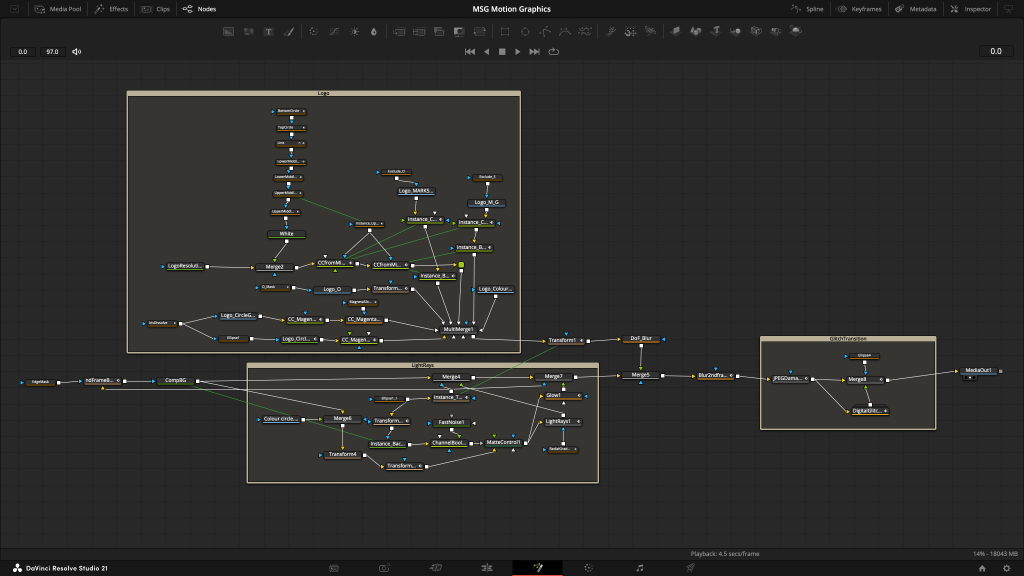
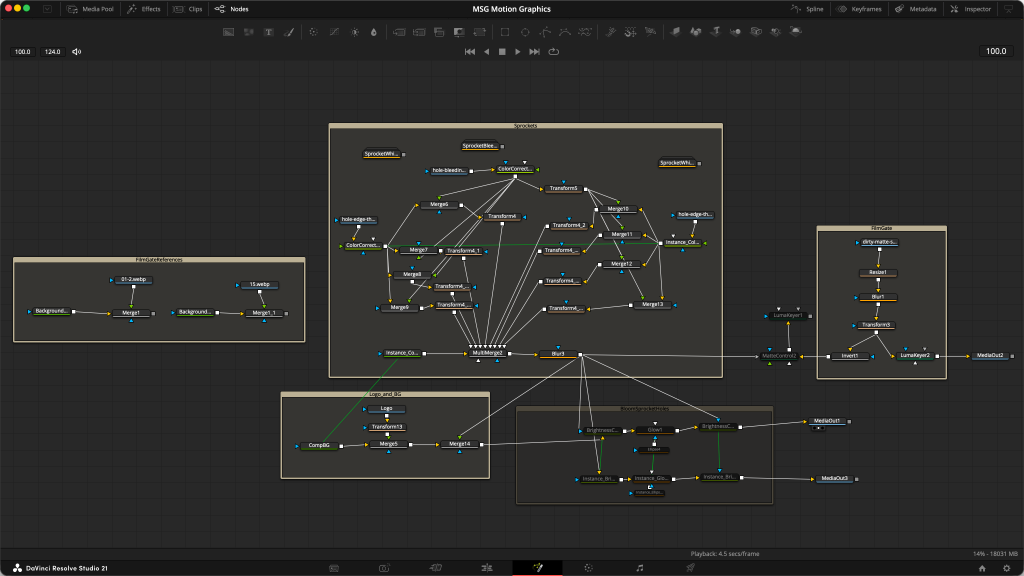
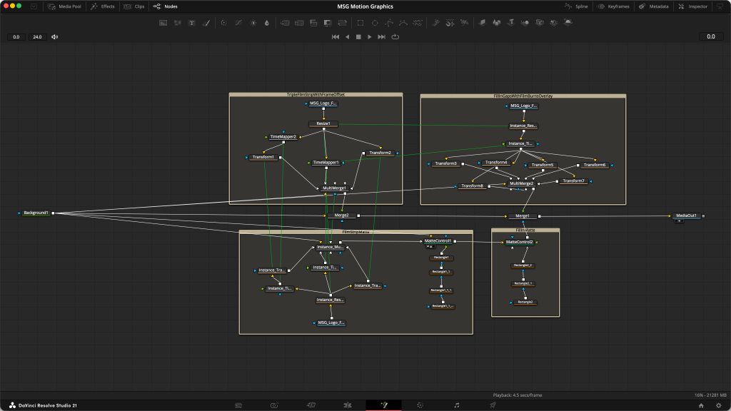
I animated two tools of my trade that adjust colour and contrast: a colour wheel and an S-curve, which forms part of my logo. From there, I transitioned with colour and finishing techniques to demonstrate my inspiration from the three eras/mediums of motion imaging: photochemical, analog video and digital. The light rays that appear after that are inspired by Toho films’ logo intro.
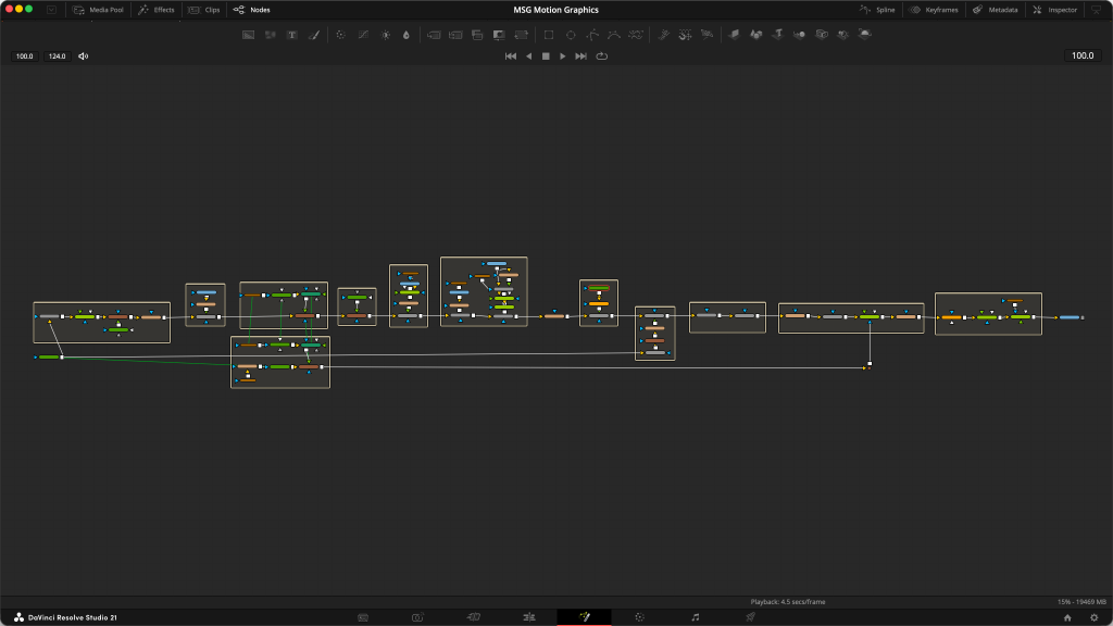
One day, I’ll go into a deeper dive about using an important concept in colour science in designing my logo, and also about the details of how I animated it. For now though, I’ll be using a shorter version of this motion design as the intro for my video content going forward. Stay tuned!